
How to Choose Your Wedding Color Palette: Season, Location, Trends or Emotion?
Choosing your wedding color palette is often the first aesthetic decision you make — sometimes even before selecting the venue. It feels instinctive, emotional, deeply personal.
But once the excitement settles, questions begin to surface. Should your colors reflect the season? The architecture of your venue? Current trends? Or simply what you love most?
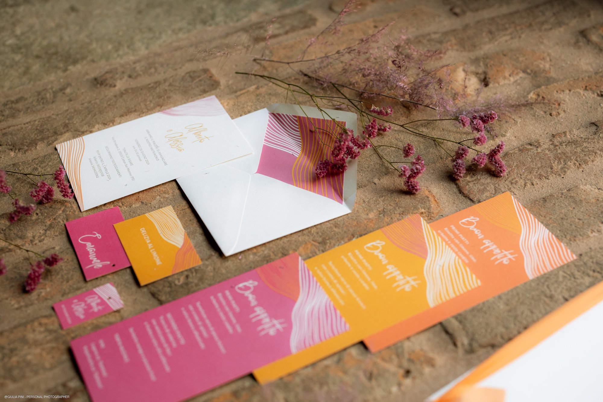
A refined wedding palette is never accidental. It is a dialogue between emotion, context and intention. And when those elements align, color becomes atmosphere rather than decoration.
Emotion First: When Color Is Personal
For many couples, color is an instinctive choice.
A shade that recalls a trip taken together. A tone that feels like home. A combination that reflects their shared energy — bold and vibrant, or soft and understated.
These choices don’t need justification. In fact, the most meaningful palettes often start from something deeply personal.
However, instinct alone is not enough.
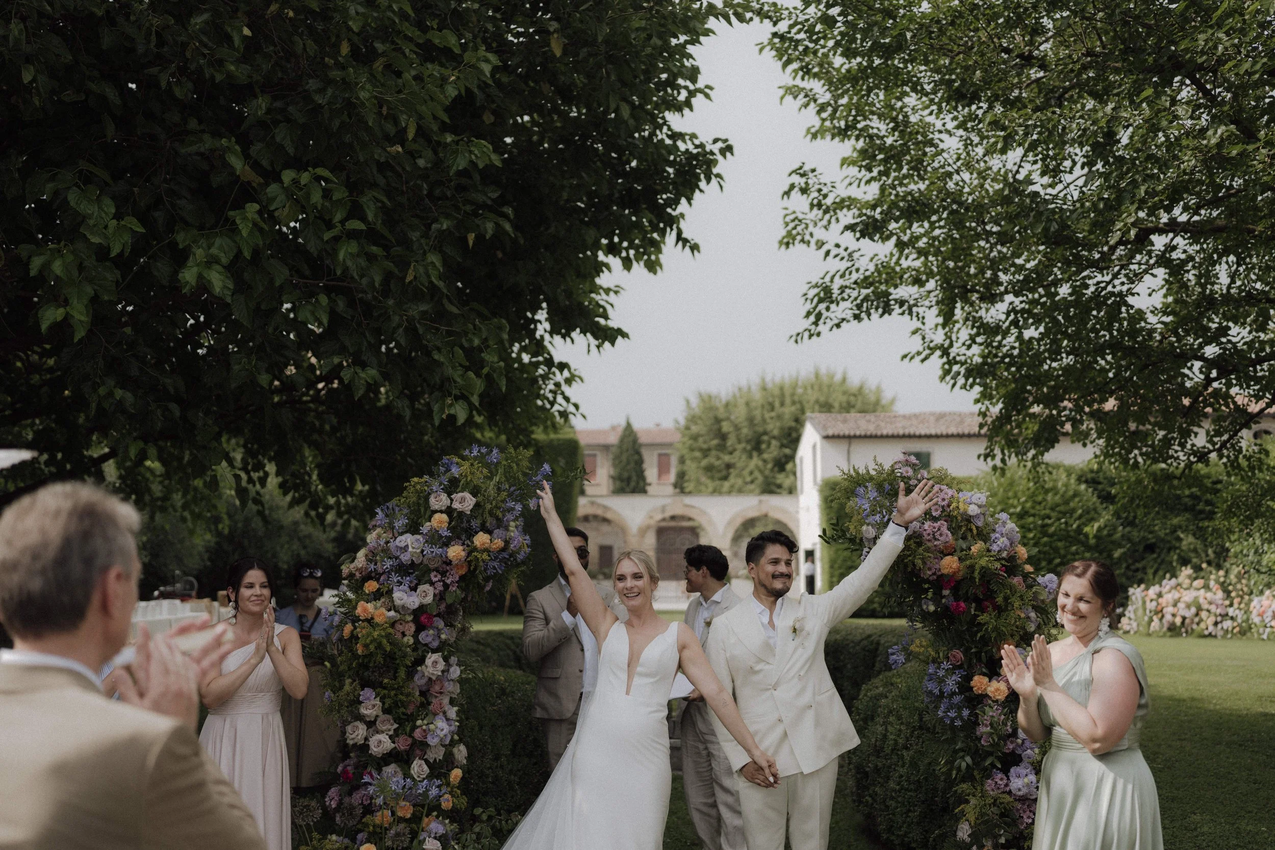
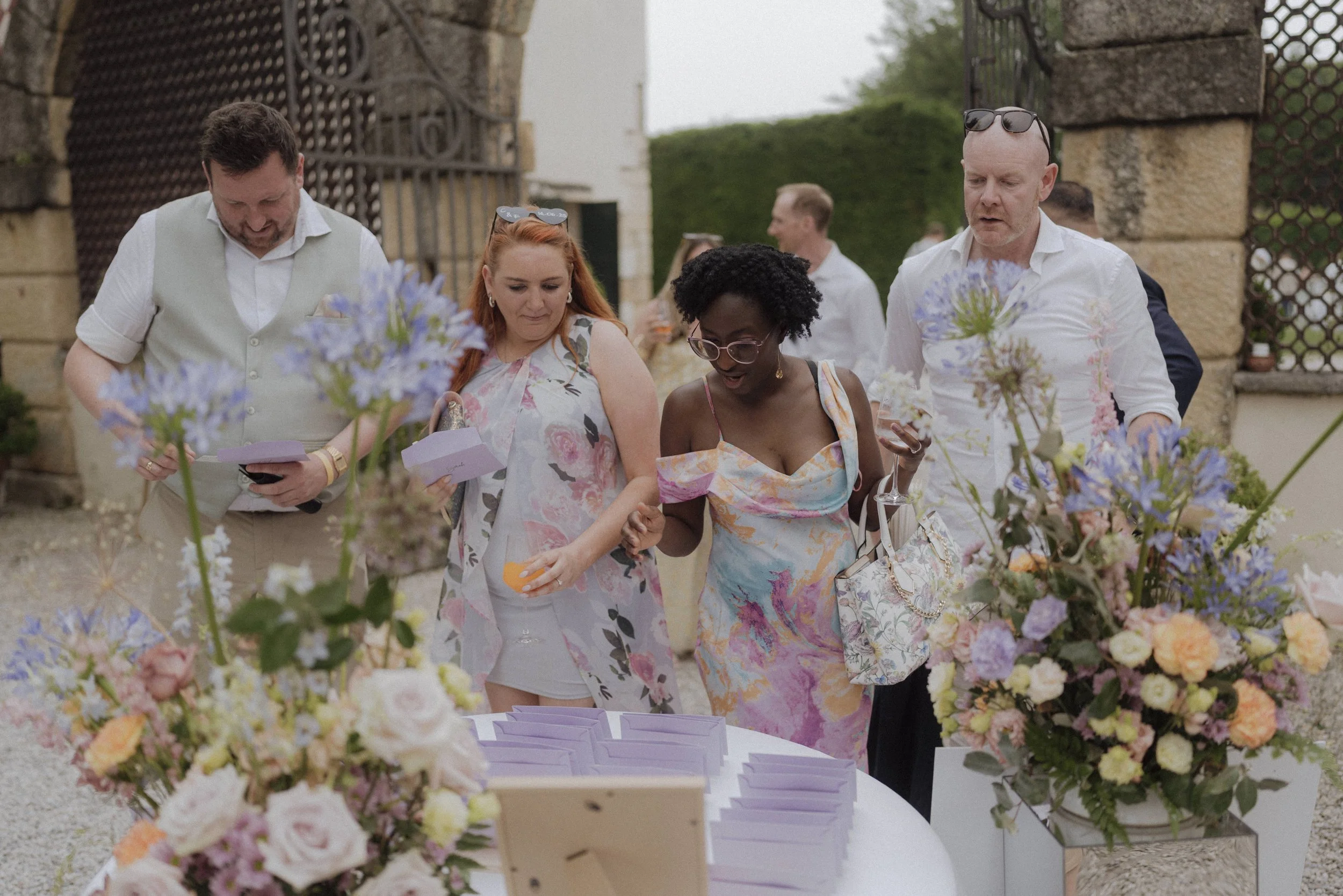
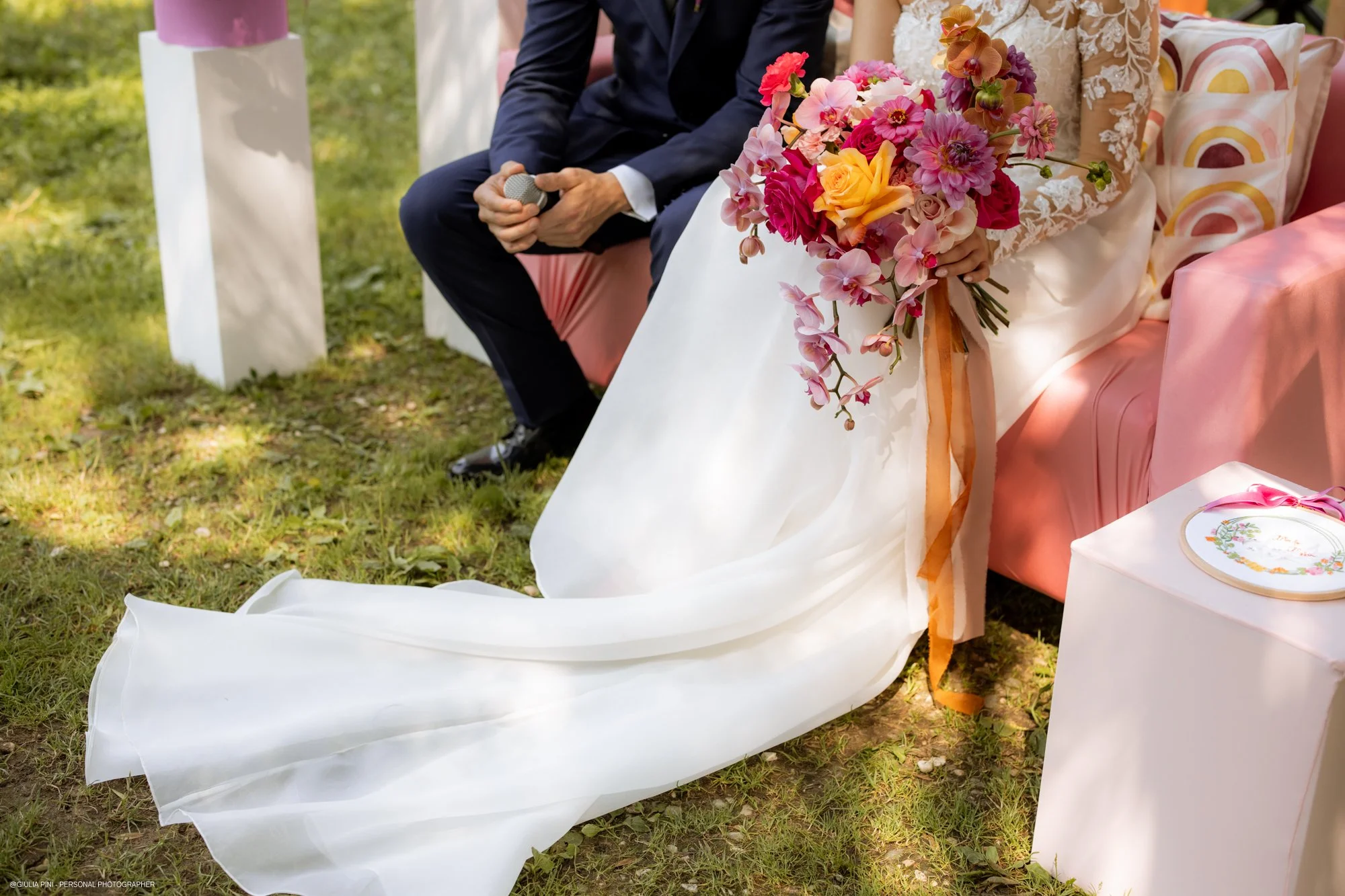
An emotional favorite color needs structure. It must be translated into materials, textures, florals, stationery, lighting and styling. A single strong hue can feel overwhelming if unsupported — but when balanced with neutrals or complementary tones, it becomes sophisticated.
Emotion should lead. Design should refine.
Let the Location Speak
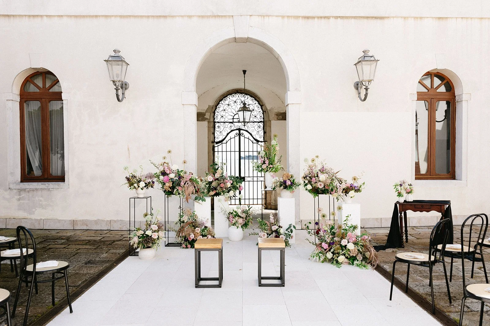
Some venues already carry a powerful visual identity.
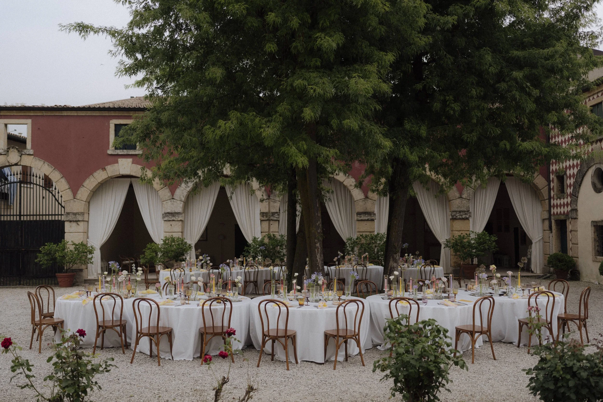
A historic palace with aged stucco and terrazzo floors.
A countryside estate framed by olive trees and stone.
A coastal terrace reflecting sky and sea.
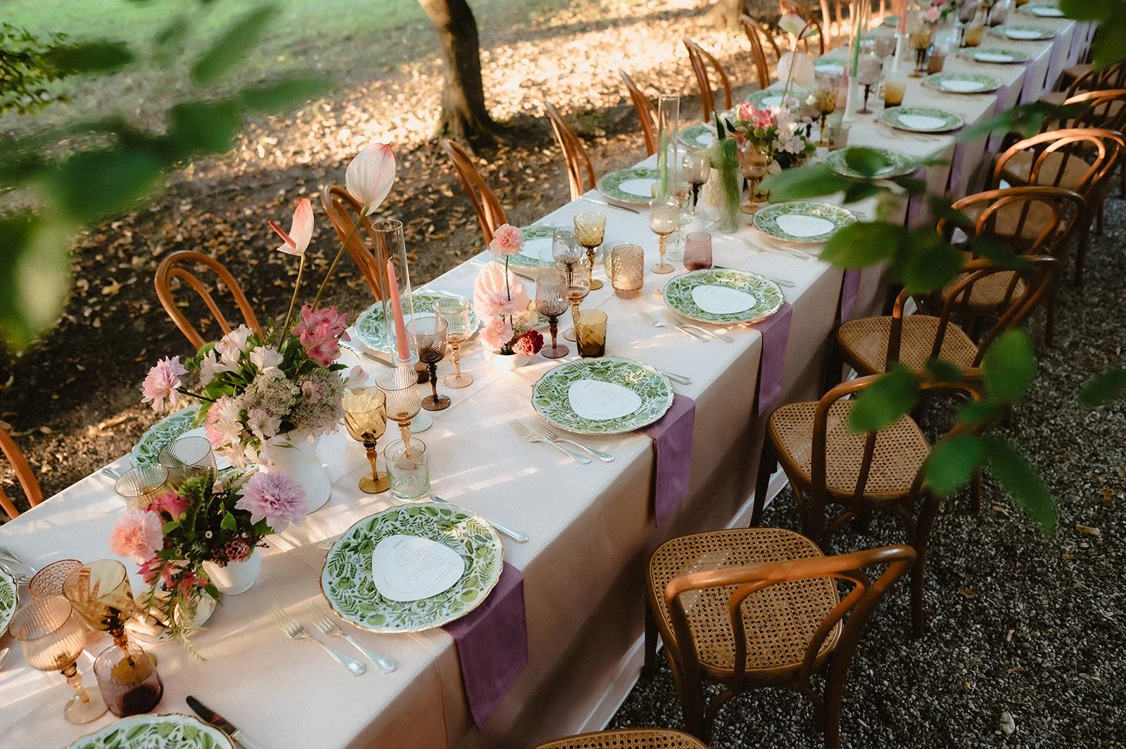
Each space has its own palette shaped by architecture, landscape and natural light. Ignoring that identity and imposing a contrasting scheme can create visual tension.
When couples choose to listen to their surroundings, something shifts. Stone suggests warm neutrals. Lush gardens can invite either layered greens or colorful choices. Terracotta walls call for dusty tones rather than icy pastels.
The most elegant weddings feel rooted in their setting.
They don’t compete with it — they belong to it.
Seasonality: An Aesthetic and Ethical Choice
Season is not just a backdrop. It is a design parameter.
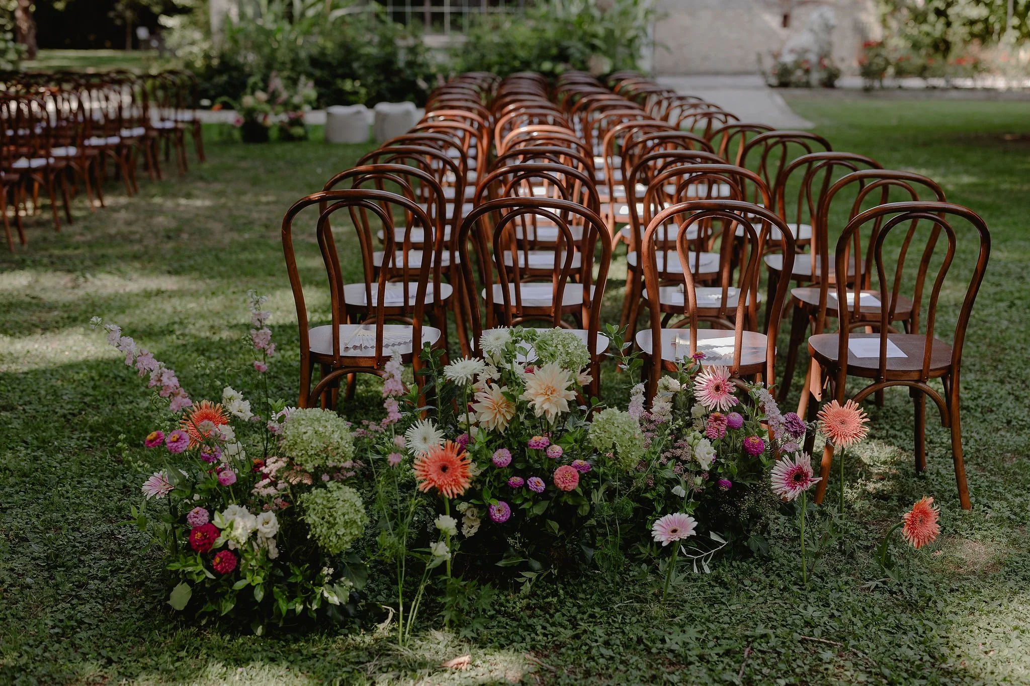
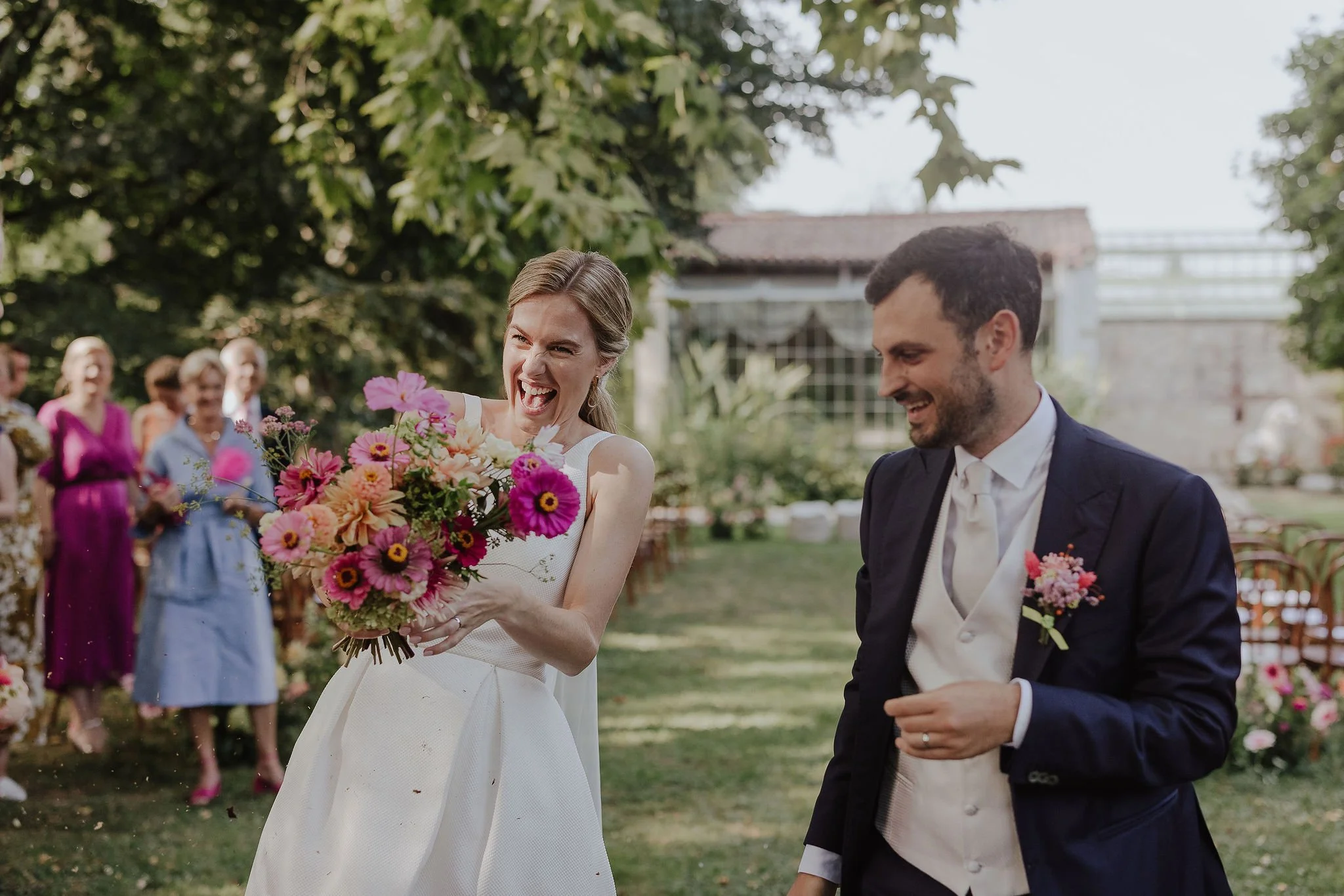
Spring offers delicacy — layered pastels, fresh greens, airy compositions.
Summer welcomes vibrancy and confident saturation.
Autumn invites depth, texture, warmth.
Winter embraces contrast, structure and mood.
But beyond aesthetics, seasonality carries ethical weight.
Choosing flowers that are naturally available in your wedding month reduces the need for long-distance imports, artificial growing conditions and excessive waste. It supports local growers and respects the natural rhythm of the environment in which you are celebrating.
For destination weddings in particular, this matters.
Working with seasonal blooms does not limit creativity — it sharpens it. It encourages thoughtful design rather than forced replication of something seen online. The result feels softer, more organic, and undeniably authentic.
When color emerges from what nature is already offering, it carries honesty. And honesty, in design, always feels luxurious.
Trends vs Timeless: Where Balance Matters
Every year introduces a new wave of trending colors. Some are beautiful. Some disappear quickly.
Trends are not inherently problematic — but they should never define the entire visual identity of a wedding.
A refined approach is strategic:
Build your foundation on timeless tones: warm whites, layered neutrals, olive greens, deep blues, muted terracottas.
Introduce trend colors as accents through stationery, florals, textiles or lighting.
This creates balance. Your celebration feels contemporary today, yet it will still feel elegant when you revisit your photographs decades from now.
The most sophisticated weddings are not trend-driven.
They are context-driven.
Common Mistakes When Choosing Wedding Colors
There are recurring missteps we often see:
Choosing a palette before securing the venue.
Forcing a flower that is out of season.
Selecting too many dominant colors without hierarchy.
Following trends without considering long-term aesthetic value.
Ignoring how light (especially in Italy) alters color perception.
Color behaves differently in strong Mediterranean sunlight than in indoor, diffused environments. Testing combinations within the actual setting is essential.
Intentional design always considers proportion, materiality and light — not just swatches on a screen.
Conclusion
Your wedding color palette is more than a decorative decision. It shapes the emotional tone of the day. It influences how your guests experience the space and how your memories will later be framed.
Emotion, location, season and proportion — when these elements work together, color becomes storytelling.
If you would like guidance in defining a palette that feels personal, refined and in harmony with your setting, we would be delighted to support you.
→ Inquire here to begin shaping your wedding atmosphere.